
Your social media creator sent you this perfect piece of content. It’s short, snappy and visually stunning. You’re hearing awards music and rounds of applause in the background. Smiling, like any modern human, you check it on your phone… and disaster.
The headline is chopped in half; the image looks like it’s been through a blender and the text? It’s so small it could be Morse code. And the layout looks like it just gave up!
Don’t worry- all you need is a little thing called mobile-first editing (and a reminder for your creator also!).
Here’s how you can fix social media content so it looks sharp for the 6-inch screen.
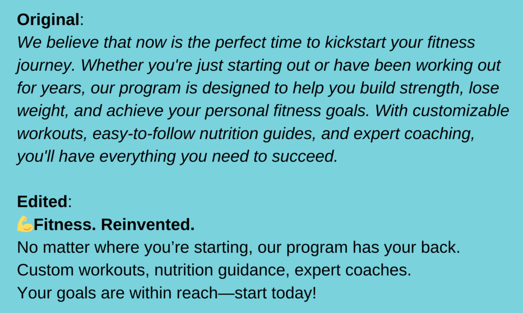
Trim the fat
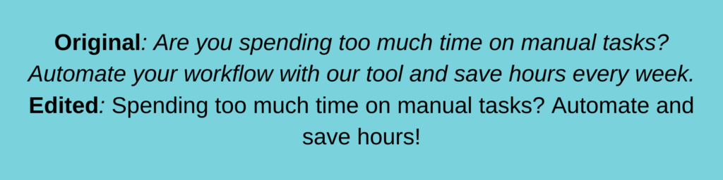
When creators use a laptop or desktop to finish creating content, they can add lose sense of space and use too many words to convey their message. Mobile screen space is limited, so long-winded captions feel overwhelming.
Cut down unnecessary words and get straight to the point.
How to Edit:
- Shorten paragraphs to just 1–2 lines. Your reader doesn’t have the time to read a short story.
- Replace wordy phrases with concise alternatives (e.g., “utilize” → “use”).
- Cut redundant sentences or ideas.
- Use visuals to convey the bulk of your idea.
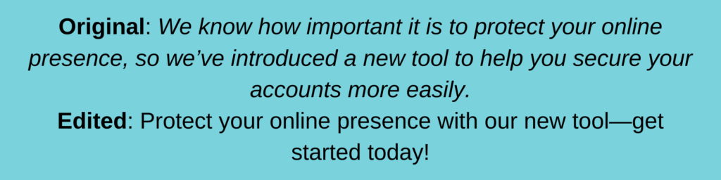
Example:
Front-load important information
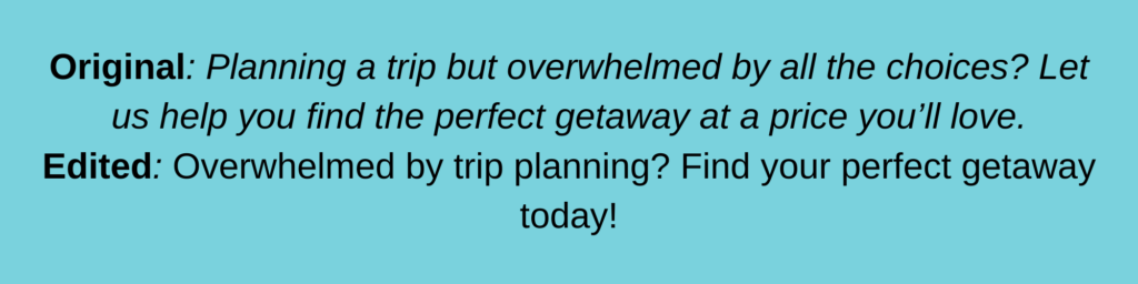
A small screen creates a tighter window of opportunity to grab attention as mobile users skim. So place the key message at the beginning of your post.
How to Edit:
- Move the most important details (offers, calls-to-action, announcements) to the first sentence.
- If it’s a caption, place the hook before the “See More” cutoff and preview your captions on a mobile.
- Use bold or italicized font to highlight your message when possible.
Example:

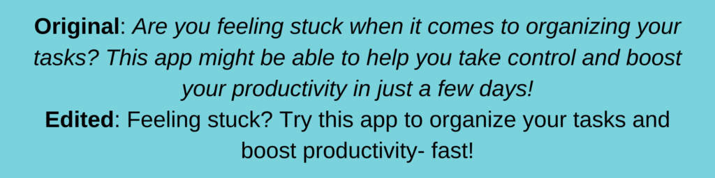
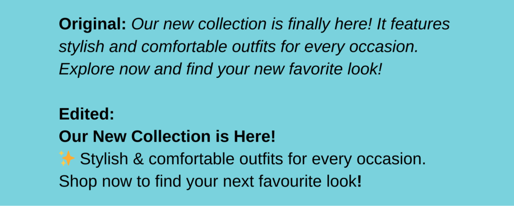
Break up the text for readability
Long paragraphs on mobile feel like a single stretch of highway with no exits- no place to rest the eyes. Break up your text to give your readers quick, easy pauses. So they can cruise through your content without feeling like they’ve hit a traffic jam.
How to Edit:
- Add line breaks between ideas. Keep individual ideas 2-3 sentences long.
- Use bullet points, numbered lists or emojis to structure information. It is the fastest way to highlight details and keep readers engaged.
- Highlight important words with caps, bold, or emojis.
Example:
Resize and check fonts for legibility
If users have to zoom in every time they see your posts, they’re likely to remember how minute your posts are and skip them altogether.
How to Edit:
- Increase font size for visuals and captions. Keep your text at 12px minimum and text within images large enough to be read without zooming
- Use sans-serif fonts for clarity (e.g., Arial, Helvetica).
- Avoid placing text over busy backgrounds. Make sure there is enough contrast so your text stands out.
- In images/videos place important text first and avoid corners where it can get overlooked.
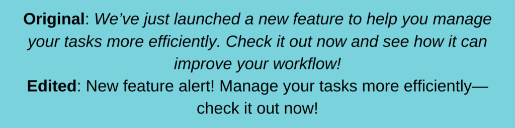
Test captions for the “See More” cutoff
Most platforms truncate captions after a few lines, showing a “See More” link. Make sure the content your readers see before this link provides enough impetus to stop scrolling.
How to Edit:
- Preview your post on a mobile device to see where it gets cut off.
- Move hooks and CTAs to the visible portion of the caption.
Example:

Make CTAs easy to find and tap
Buttons, links, and CTAs should be as easy to tap as pressing a button on an elevator. If your readers can’t find them quickly, they’ll skip to the next available offer- no matter how enticing you make yours.
How to Edit:
- Keep CTAs short and action-oriented (e.g., “Shop Now,” “Learn More”).
- Space out your CTAs to avoid competition and crowding.
- Place CTAs at the top or end or end of your post or in the most visible part of your visual.
- Use link shorteners to simplify URLs.
- Use contrasting colors to make your CTAs stand out, especially in visuals.
Preview and test your edits
Even after you’ve edited for all of the above, your posts require one final test before going live.
- Test on both iOS and Android devices. This way you’ll know if you need to tweak your posts further.
- Check text alignment, image quality, and spacing.
- Confirm that all links and CTAs function correctly.
Editing social media posts for mobile-first viewing is all about clarity and user experience. You want to capture your audience’s attention—even during quick scrolls. Isn’t the real challenge communicating meaningfully in a world that’s always on the move?